Real vs Replica
Supreme Box Logo Tee

Since its launch, Supreme has been coming up with new tees each season, mostly the signature box logo tee or tees with different graphic prints. The same label is used each time, as part of the Supreme branding, but at the same time this makes it easy for high quality replicas to learn the design and flood the market. For this real vs. replica comparison, we'll be focusing on the iconic box tee.

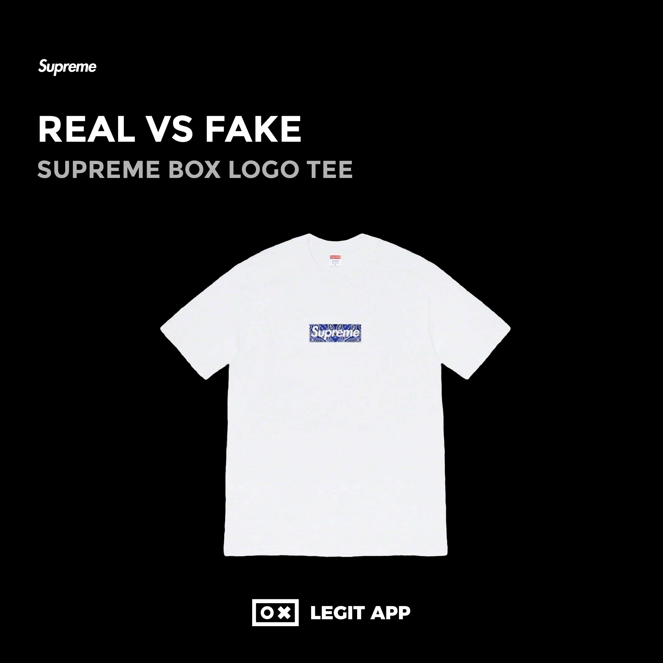
Supreme's box logo tee features a very minimalist design of just a crew neck shirt with the red logo. Let's have a closer look at some key details.
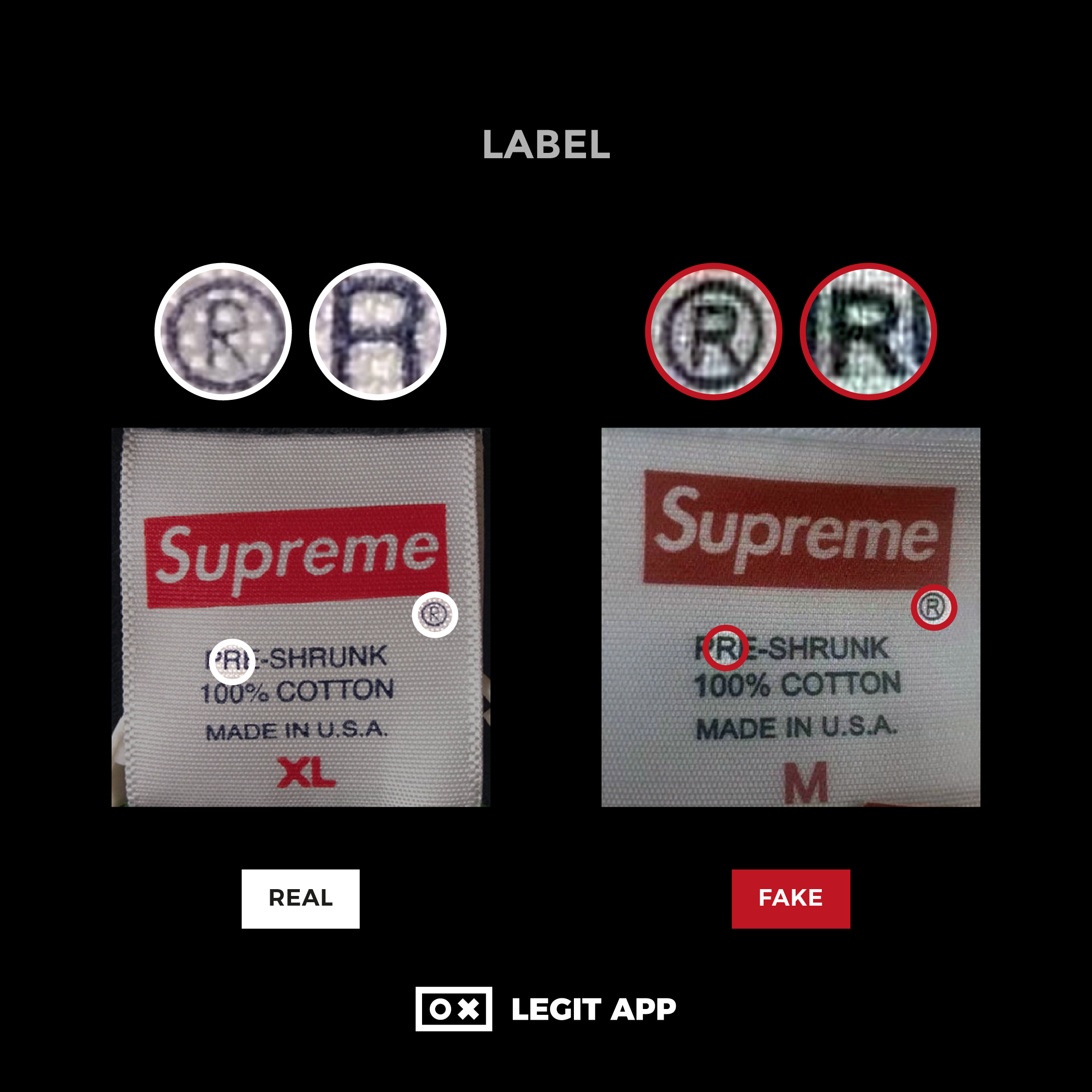
Label - on the real tee, the logo looks full and the print is clear. The edge of each letter is smooth with no fuzzy sides. In comparison, the font on the replica logo is slightly rounder and the edges are not smooth. The replica logo looks too deliberate.
Registered Trademark Symbol - the symbol is usually a shade lighter than the rest of the label on the real tee. The font used for the letter "R" on the replica is different, and as a result it is rounder.


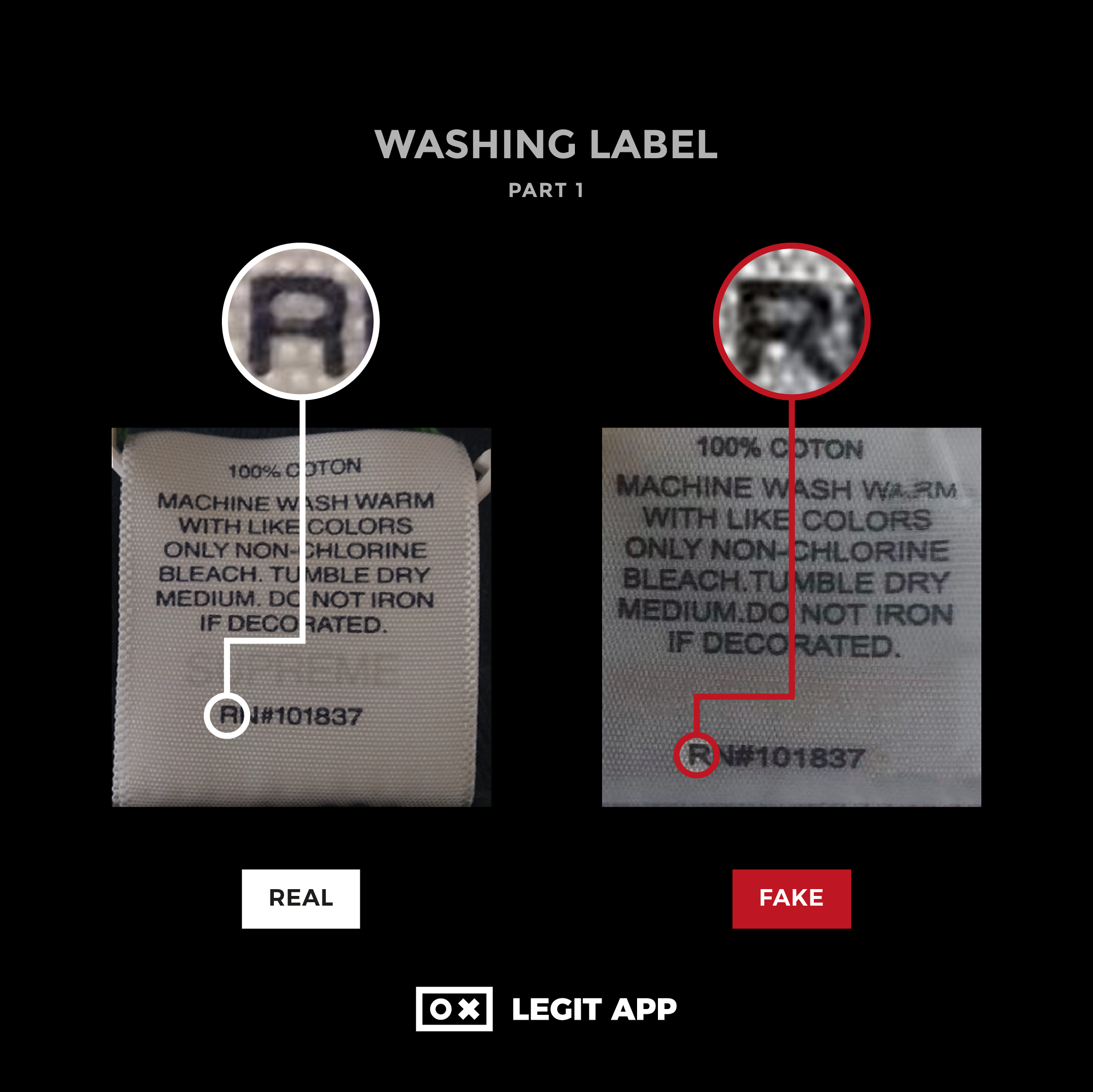
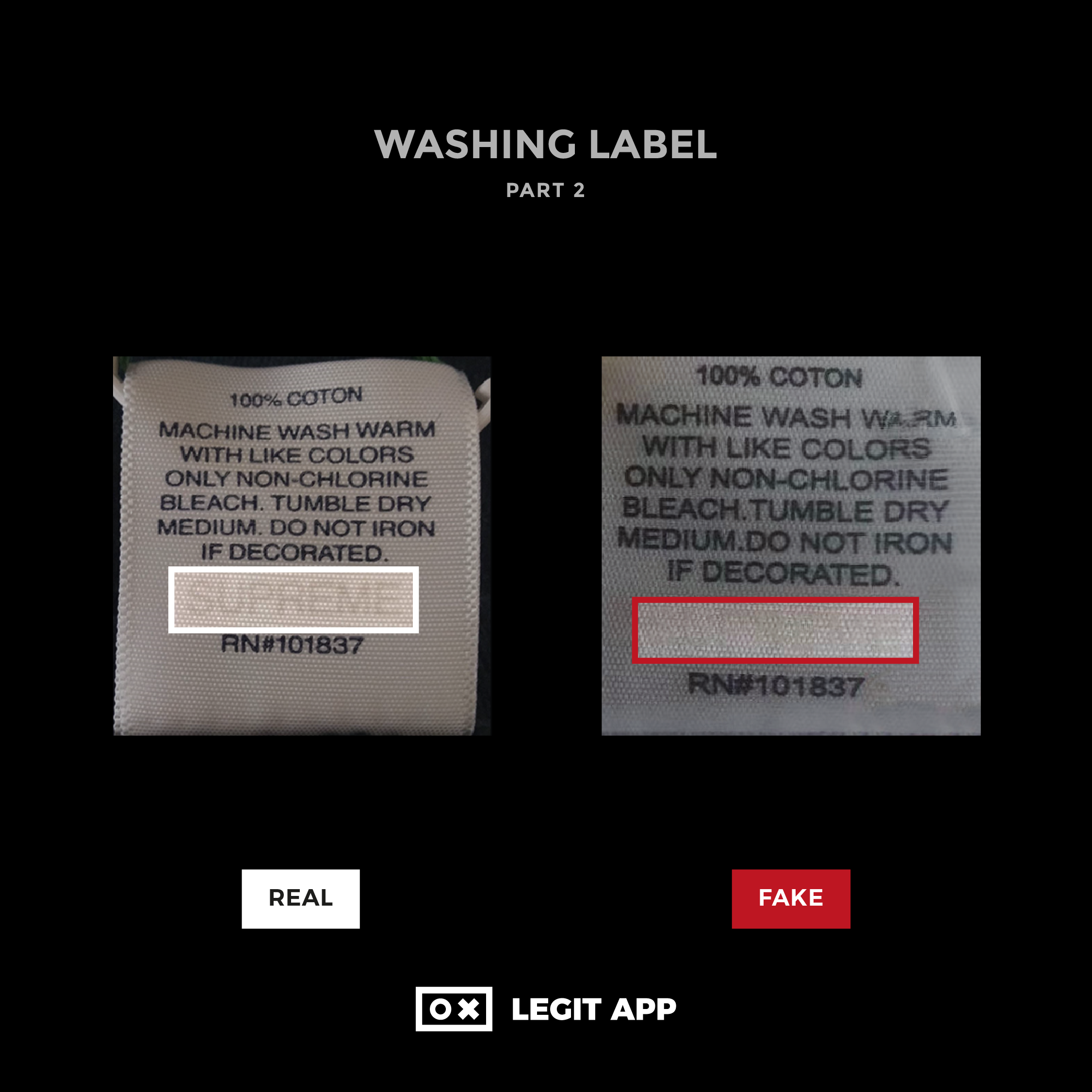
Washing label - again, the "R" looks rounder here on the replica version. The Supreme watermark, when it appears, should be clear and neat. Replica tees often have messy watermarks with uneven sized or different looking letters.

Have questions or a Supreme item that needs authenticating? Head over to LEGIT APP and get one of our Authenticators take a look for you.


 Streetwear
 Supreme
 T-Shirts